
Merging 2012 by Masha Reva
Merging 2012 by Masha Reva
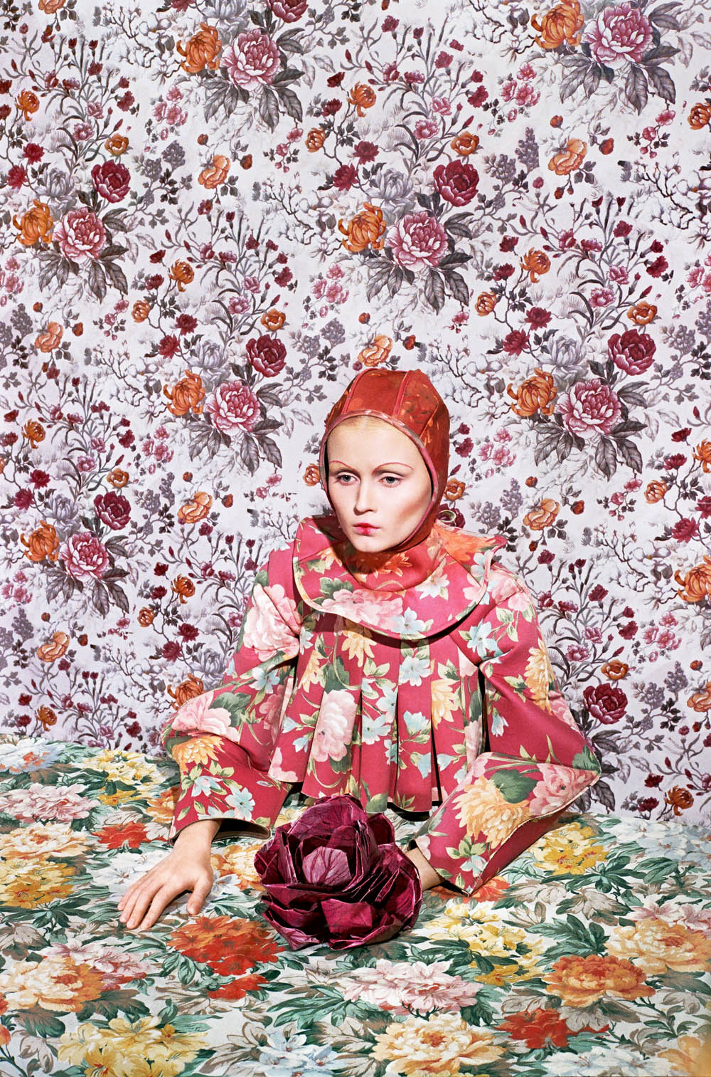
I saw this collection by Masha Reva, and shoot by Synchrodogs, some months back and it has stayed in my mind ever since.
Pattern and contrast is the extreme opposite of my own personal style, like so far apart it is untrue. But maybe this is why I am so attracted it? I think it is stunning but actually quite obscure at the same time. Which is what makes it absolutely work I reckon.
There is so much going on in some of the scenes, yet the clothes still manage to draw your attention straight away – I guess that is what you get from great design…!
Anyway, I love it. See your yourself and decide what you think….
http://thisispaper.com/filter/fashion/Masha-Reva-Merging-2012
http://www.mashareva.com/main/index.php?/fashion/-/

Something like this perhaps.. http://en.wikipedia.org/wiki/File:Gustav_Klimt_046.jpg ?
Or… http://en.wikipedia.org/wiki/File:Gustav_Klimt_039.jpg?
I suppose what drew the comparison in my head was the flat patternation of much of the space, which can become quite abstract, compared with moments of figurative description.
Hi,
Right ok I see what you mean. Yes, i think there probably is some influence from Klimt: taking the contrast of pattern against the figure and face. Good spot! You know art :)
Do you think there is a relationship, visually, with this and (for example) a Klimpt painting?
Hey Bob,
I probably don’t know Klimt as well as you, but I can see that there could be some influence from his work in this shoot. I like how serene the models face is, in comparison to the clothes and background – maybe there are similarities there? What do you think?